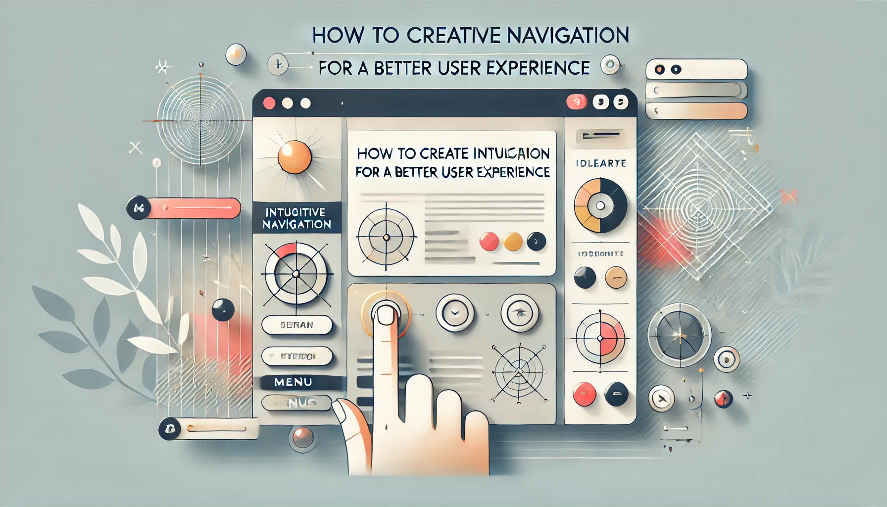
When users visit your website or app, one of the first things they’ll interact with is the navigation. If they can’t find what they’re looking for quickly, they’ll likely leave and head to a competitor’s site. That’s why intuitive navigation is a key factor in delivering a great user experience (UX). But what exactly does intuitive navigation mean, and how can you design it effectively?
In this post, we’ll dive into the best practices for designing navigation systems that make it easy for users to find what they need, ensuring they stay engaged with your website or app. Let’s explore how a well-designed navigation structure can boost user satisfaction and drive conversions.
Why Intuitive Navigation Matters for UX
Intuitive navigation is all about providing users with a smooth, efficient way to access content and features without confusion. It's not just about a pretty menu—it’s about the ease and flow of the user’s journey. Think of it as a roadmap for your website or app: the clearer and more logical the path, the better the user experience.
A poorly designed navigation system can lead to:
- Frustration: Users get lost, feel confused, and eventually leave your site.
- Increased Bounce Rates: Users don’t stay long enough to explore your content.
- Reduced Conversions: When users can’t find what they need, they won’t take action (like making a purchase, signing up, etc.).
Good navigation, on the other hand, can:
- Increase Engagement: Users will stay on your site longer when they can quickly find what they need.
- Enhance Accessibility: Intuitive navigation makes your site or app more usable for everyone, including those with disabilities.
- Improve Conversion Rates: Clear and easy navigation can guide users toward completing a desired action, such as purchasing a product or signing up for an email list.
Best Practices for Designing Intuitive Navigation Systems
1. Keep It Simple: Less Is More
The best navigation menus are the simplest ones. Overloading users with too many options can be overwhelming and confusing. Keep your main menu minimal and only include the most important pages or features.
Tip:
Use clear, concise labels like “Home,” “Products,” “About Us,” and “Contact.” Avoid jargon or technical terms that may confuse users. For example, don’t use “Solutions” if it can be more clearly labeled as “Services.”
2. Prioritize Content Hierarchy
Not all pages on your website or app are equal. Organize your content in a way that prioritizes the most important pages at the top level, with secondary pages nested underneath. This creates a logical flow for users and allows them to find what they’re looking for without too much effort.
Tip:
Use a top-down hierarchy for the main menu and ensure that your most visited or important pages are easy to access. For example, the homepage, product pages, and customer support should be in the primary navigation, while blog posts, resources, or FAQs can go in secondary menus or footer links.
3. Use Clear and Descriptive Labels
The labels on your navigation menu should clearly communicate what the user will find when they click. Avoid ambiguous labels and instead use language that is familiar to your target audience.
Tip:
Be as descriptive as possible. Instead of labeling a menu item “Resources,” try “Blog” or “Case Studies” to give users a better idea of what they’ll find. This minimizes confusion and helps users make quick decisions about where to go next.
4. Make Navigation Easy to Find and Accessible
Navigation should be one of the first things users notice when they land on your site. Use a prominent position—usually at the top of the page for desktop views and at the bottom or top for mobile.
Tip:
Ensure that your menu is mobile-responsive. A hamburger menu (three horizontal lines) is a great option for mobile devices, but make sure the text is large enough to read and the links are easy to click.
5. Include Search Functionality
While a well-structured navigation menu is essential, some users will want to find content quickly using a search bar. Including a search function can drastically improve the user experience, especially on content-heavy websites.
Tip:
Make the search bar easy to locate and large enough to be noticeable, especially for mobile users. Also, include filters or auto-suggestions to help users find what they need more efficiently.
6. Maintain Consistency Across All Pages
Consistency is key to making navigation feel intuitive. Whether users are on your homepage, product page, or blog, the navigation should remain the same across all pages. This helps users know where to look no matter what page they’re on.
Tip:
Keep the navigation bar in the same position across all pages. The layout should remain consistent so that users don’t have to figure out a new way to navigate when they move between pages.
7. Provide Visual Cues
Visual cues, such as hover effects and active state indicators, make it clear to users which menu items are clickable and where they currently are in the navigation.
Tip:
For example, use a different color for the active page link, or add an underline or subtle animation when a user hovers over a clickable element. These cues guide users and help them understand how to interact with your navigation system.
8. Test and Iterate
Once you’ve designed your navigation, it’s important to test it with real users to ensure it’s as intuitive as you think. Usability testing helps you identify pain points and areas where users might be getting lost.
Tip:
Use tools like Hotjar or Crazy Egg to track user behavior and see where people are clicking most often. Conduct A/B testing to try different layouts or designs and see what works best for your audience.
Conclusion: Intuitive Navigation = Better UX
Designing intuitive navigation isn’t just about making your website look nice—it’s about making it easy for users to get what they need as quickly as possible. By following these best practices, you’ll create a navigation system that feels seamless, user-friendly, and optimized for conversion. So, next time you’re working on a UI/UX design, remember: good navigation is the key to a great user experience.


